What's important? Do my users know? How will they know? - The WHAT

In a previous post, I explored the paradox of Analytics, Visualization and Communication. At the end, I teased the best way to do this is thoughtful design. I asked the question:
What's important? Do my users know? How will they know?
Design is fundamentally a purposeful application of context that helps people understand and use things. That's it.
When it comes to data visualization, this often means helping users understand, WHAT? Another question to ask yourself is actually, SO WHAT? That's right - why does this matter? Why is this relevant? This analysis should be meaningful to someone. In a business context, your analysis should be effective and touch an organizational value chain, such as customer retention, supply chain, profitability, brand sentiment, etc. That "WHAT" should be a critical component of why you put the visualization together - so don't lose sight of it. To aid this, here are some questions to prompt thoughtfulness about "the what" of your data visualization.
PURPOSE: What story are you trying to tell? What's the business context? What's the value? Before starting a visualization journey, consider the goal of the visualization you want to produce. Also evaluate the type of analysis performed:
- Descriptive, describing what's happening?
- Diagnostic, explaining why something happened?
- Predictive, showing what will happen?
- Prescriptive, detailing how something will happen?
- Cognitive, answering questions the way a human might?
Some of these may not require, or be best presented with, visualization. Other interfaces may be better. In Power BI, this might mean sharing a dashboard capable of Q&A.
LANGUAGE: After we've defined the purpose, the why, it's time to actually name this analysis. What should it be called? For this, remember the acronym, KISS, meaning Keep. It. Simple. Silly.
Things to consider here are:
- Is the tittle relevant?
- Does it evoke emotion?
- Is it accurate of what the data portrays?
- Is it accessible?
- Do we help describe the data?
If a user with no context gets more context after reading your title, then you're doing it right.
ACCESSIBILITY: It's time to relate this analysis to the user. What can we do to make it easy? We should consider that people understand things differently. So in the context of describing what, we need to help everyone understand the analysis:
- Things should be easy to understand
- Links should be available for more background
- The WHAT should be obvious.
In Power BI, this can be done a myriad of ways. Consider the following screenshot. I''ll use this screenshot over and over again to describe some Do's and Don'ts in data visualization in future blogs. Here, the context is, A fictional Ad Agency is tracking the effectiveness of various Twitter campaigns and hashtags. In reality, we would want a lot more context, and something attached to an actual value chain of this business. But, I digress. Let's take a closer look.
 |
| An example report we will dive into. Note: All content is falsified and exemplary only. |
1. PURPOSE : What type of analysis is this? What should users know when they get here?
In the example, above, we start by defining what this is: Twitter Analytics, by Campaign. This font is big, and pops at you when you look at the screen.

 |
| We might provide descriptions and navigation options at the top of the page for the user. |
Consider adding add a title to your report. In some cultures, this may mean putting it on the left-hand corner of your page - but in others, it should be on the right hand corner. Other times, it may not be necessary. Choose what makes the most sense in your case.
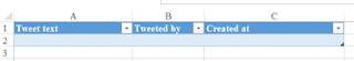
2. LANGUAGE: What does this "stuff" all mean? How should it be interpreted?
We briefly describe what each visual depicts, by using titles.
 |
| Adding a descriptive title gives this visualization context. |
Also consider, what is the primary, secondary or tertiary language of your users consuming your analysis? Make sure things make sense to them. This might actually mean using symbols and pictures over text:
 |
| If we cannot translate, aid examples by using helpful symbols. |
Finally, consider the actual name of your .PBIX file. This is often visible:
 |
In Power BI, Workspaces and Dashboard/Report titles may be visible, so give them appropriate titles for context
|
Therefore, name your analysis and visualizations wisely. Choose meaningful, simple descriptors that translate and are non-ambiguous. In the example above, I might choose, "analysis," instead of "analytics."
3. ACCESSIBILITY: What should users know before they get here? How can we them, get it?
In your visualizations, consider describing charts, graphs and images using fonts that are easy to read in your visualization projects:
- Verdana
- Lucida Sans
- Tahoma
- Georgia
(http://accessibility.psu.edu/legibility/fontface/) for more information.
Note that Power BI supports these fonts and many more. We'll talk about what makes visualization easy to read in future posts.
In addition to choosing the right font, we might call the first page, "Home." This helps give the user context of where they are, but also informs them there's another page. That's because we've added another page, called "Help." This provides background information on what the visualization is, and helps users use the content more effectively. It meets user expectations of what the page should be.
| Use page navigation to help users. Don't rely on defaults. |
Consider your use of the page tabs. Are you using these effectively? If you use the default, it will say Page 1. This can be misleading if there's only one page. Consider also, perhaps you need a FAQ page or hyperlink to describe the analysis that has been or should be done. If so, make this easy and obvious.
Also consider adding Alt Text to ensure your audience can understand what you are trying to communicate with a visual, even if they cannot see the visual, image, shape, or textbox.
 |
| Use Alt Text in Power BI to aid in content comprehension |
Power BI has put a solid emphasis lately on accessibility . I hope this is an area they continue to invest in as "accessible design" is simply, "good design." On that note, we'll talk about colors, contrast, and other important design considerations as we continue diving into What's important? Do my users know? How will they know? in future blogs.
Leave me
a comment below if you have thoughts, perspectives or questions on anything
I've covered here so far.
Thanks for helping us understand this topic. You have written it in a way that makes it very simple to understand. Thank you so much. BIM documentation in USA
ReplyDeleteVIZUALIZATIONS
ReplyDeleteHi, Very nice article. I hope you will publish again such type of post. Thank you!
Corporate gifts ideas | Corporate gifts
Corporate gifts singapore | Corporate gifts in singapore
Promotional gifts singapore | Corporate gifts wholesale Singapore
Business card holder singapore | T shirts supplier singapore
Thumb drive supplier singapore | Leather corporate gifts singapore
ucuz takipçi
ReplyDeleteucuz takipçi
tiktok izlenme satın al
binance güvenilir mi
okex güvenilir mi
paribu güvenilir mi
bitexen güvenilir mi
coinbase güvenilir mi
TÜL PERDE MODELLERİ
ReplyDeleteMobil Onay
mobil ödeme bozdurma
nft nasıl alınır
ANKARA EVDEN EVE NAKLİYAT
TRAFİK SİGORTASİ
Dedektor
web sitesi kurma
Aşk Kitapları
tuzla vestel klima servisi
ReplyDeletependik toshiba klima servisi
kadıköy lg klima servisi
maltepe alarko carrier klima servisi
üsküdar samsung klima servisi
beykoz mitsubishi klima servisi
ataşehir vestel klima servisi
çekmeköy bosch klima servisi
ümraniye alarko carrier klima servisi